Solus "Women’s Boutique Fitness"
Train. Refine. Rise.
Project Type
Naming / Brand Strategy / Brand Identity / Art Direction / Photography / Social Media
My Role
Naming / Visual Identity / Art Direction / Photography Concepts
Client
Solus
Project Overview
Solus is a premium women’s fitness destination created around the harmony between strength, serenity, and personal refinement.
The brand combines fitness, yoga, HIIT, and holistic wellness within a considered environment that brings together individual focus and the collective energy of a community.
Our ambition was to create a distinctive fitness identity that felt luxurious without becoming distant, and powerful without sacrificing tranquility.
The Challenge
The brand needed to stand apart from conventional gym identities.
Rather than competing through aggressive fitness messaging, it needed to communicate a more refined philosophy of wellness, one that combined performance, recovery, mindfulness, and an elevated lifestyle experience.
The Creative Idea
The naming exploration led to Solus, a distinctive name concept inspired by the emotional idea of solace, restoration, and finding personal clarity.
The brand philosophy explored the balance between individual well-being and collective motivation.
This informed a visual identity that felt expressive yet minimal, warm yet confident, and energetic yet composed.

Bringing It to Life
The visual identity was built around a distinctive wordmark, elegant editorial typography, refined brand applications, and a considered color system.
Three signature colors defined the visual character:
Sinopia — vitality, warmth, and confident energy
Lush Beige — clarity, softness, and balance
Dark Slate Grey — stability, trust, and quiet sophistication
The typography balanced elegant, expressive serif headlines with clean, modern supporting text.

Two complementary photography directions were developed.
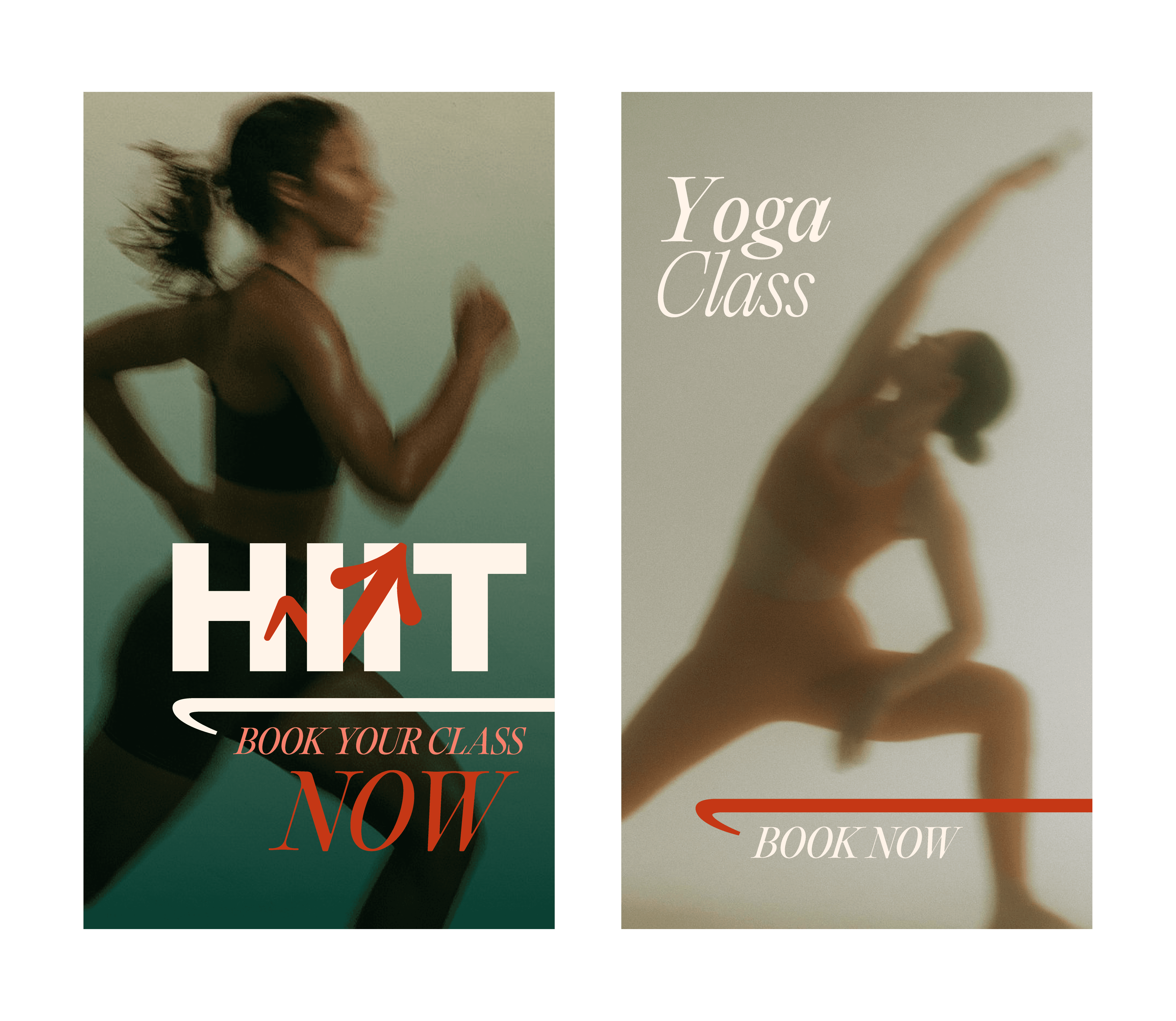
The first used experimental motion blur and atmospheric imagery to capture the soul in motion, expressing mindfulness, self-awareness, and the relationship between movement and inner stillness.
The second focused on authentic physical movement, studio environments, exercise equipment, and the details of the wellness experience.
Together, these approaches allowed the visual language to communicate both the emotional and physical dimensions of Solus.
We extended the identity across brand applications, merchandise, a custom pictogram system, social media posts, and story templates.
The social media direction continued the same visual philosophy through thoughtful imagery, elegant typography, and messaging centered on mindfulness, focus, and personal growth.
The Work
Merchandise and Brand Applications


Lifestyle and Studio Photography

Social Media Posts

Social Media Stories
My Contribution
Brand naming and conceptual development, visual identity, art direction, color and typography direction, photography concepts, iconography, brand applications, and social media art direction.
